LGBTQIA2S+ inclusion presentation
Project overview
This comprehensive presentation focuses on fostering LGBTQIA2S+ workplace inclusion, advocating for a culture of respect, safety, and visibility. Through detailed content and strategic visuals, the presentation educates employees and management on the importance of inclusivity and provides actionable steps for creating LGBTQIA2S+ friendly workspaces. Each slide is carefully designed to communicate key concepts around safe spaces, inclusive language, visible representation, and allyship.

An introduction slide that sets the tone for the entire presentation, emphasizing the importance of creating safe spaces for LGBTQIA2S+ employees in the workplace.
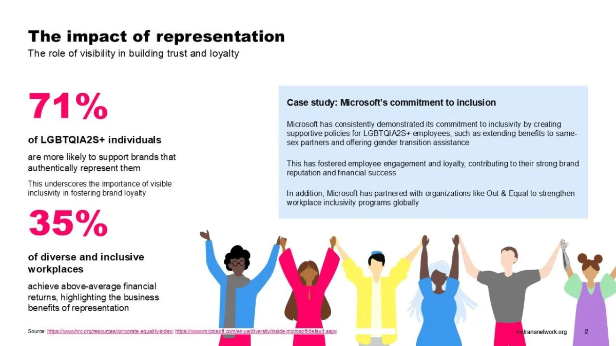
This slide highlights how LGBTQIA2S+ representation can strengthen brand loyalty and foster employee trust, with real-world examples from leading companies.
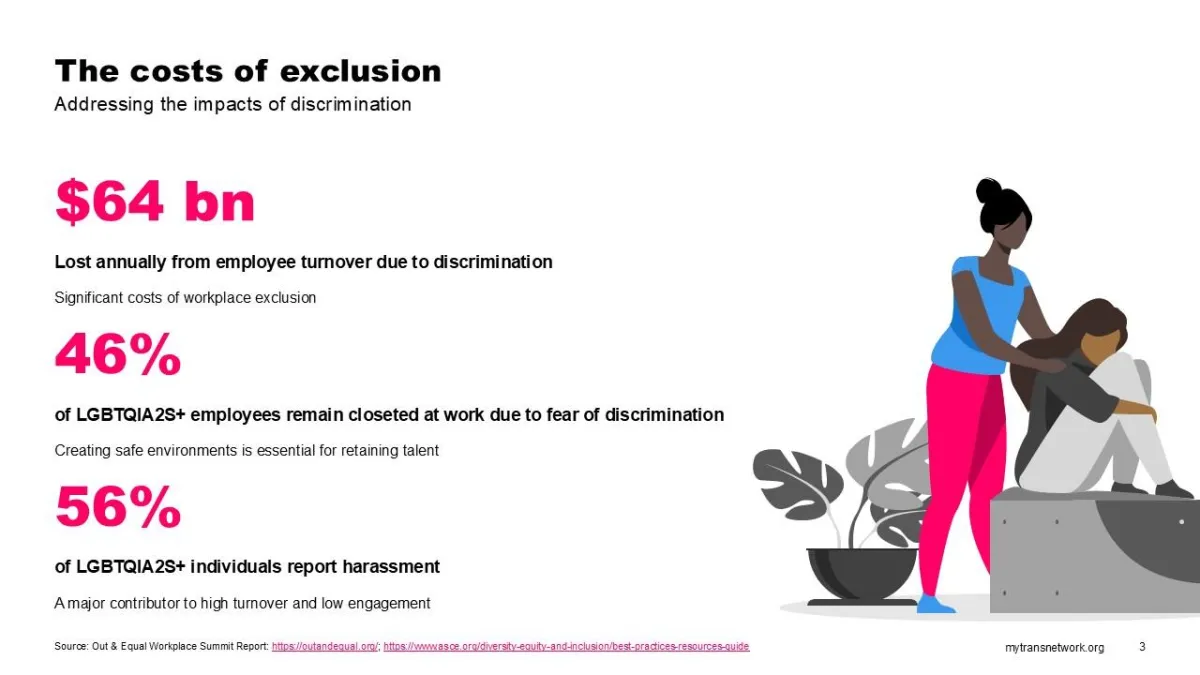
This slide outlines the real-world costs of exclusion, including increased turnover rates and the financial impact on businesses.
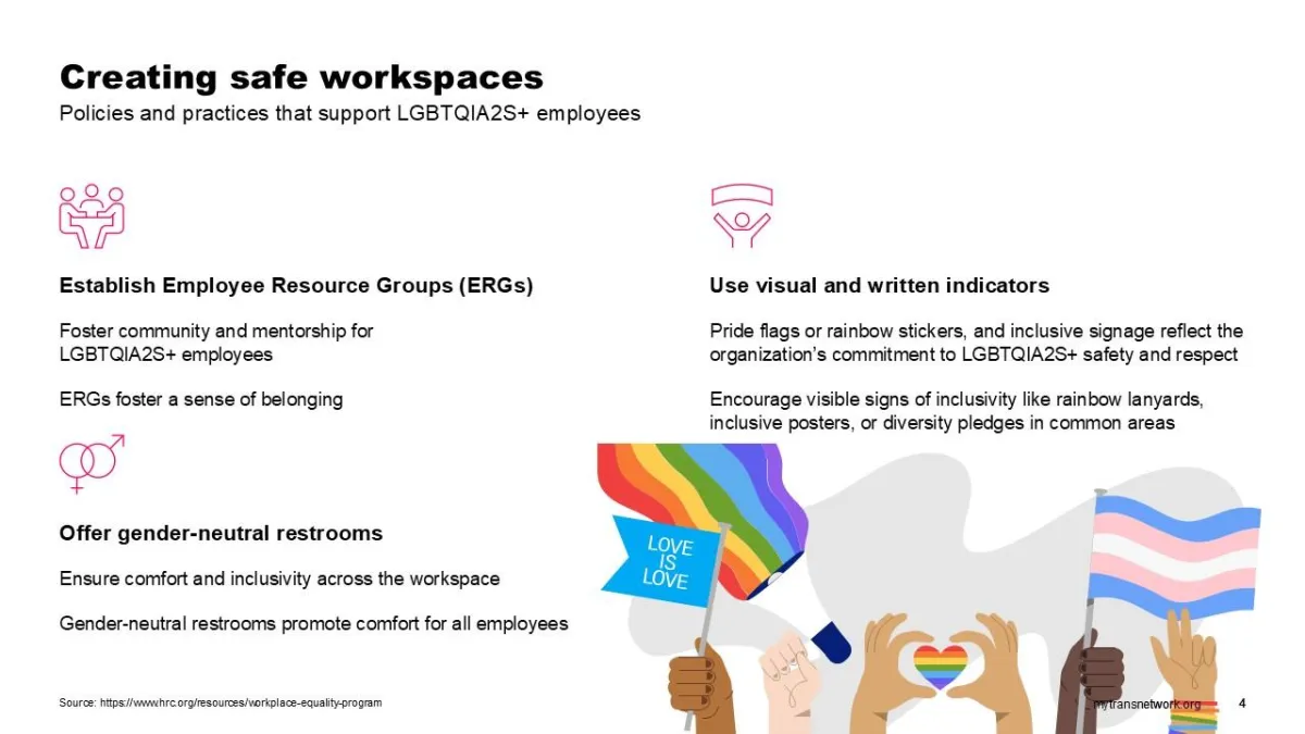
Key strategies for creating safe, welcoming workspaces, including policies like ERGs, gender-neutral restrooms, and inclusive signage.
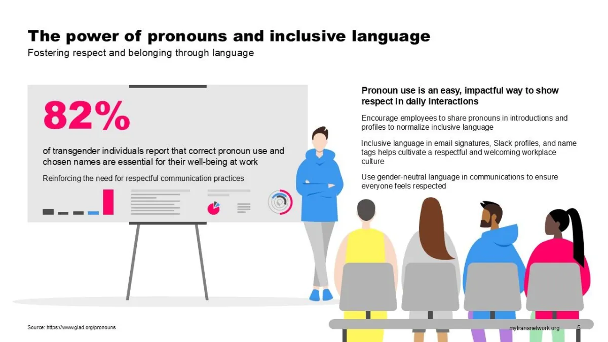
This slide emphasizes the significance of using correct pronouns and inclusive language, providing actionable tips for improving communication in the workplace.
Process overview

Research
I conducted in-depth research into workplace inclusion strategies, gathering data on the positive impacts of visible LGBTQIA2S+ representation, the financial and human costs of exclusion, and the benefits of inclusive hiring practices. This research included studying reports from organizations like Out & Equal, GLSEN, and Microsoft’s diversity initiatives, which highlighted effective practices in supporting LGBTQIA2S+ employees.

Design strategy
The goal of the presentation was to balance comprehensive data with user-friendly design to facilitate understanding and engagement. I structured the presentation to be visually appealing yet informative, incorporating clear, direct statistics and illustrations that aligned with each concept. The color palette, typography, and iconography were selected to be approachable while maintaining professionalism.

Execution
Using Adobe Creative Suite and custom illustrations, I crafted the slides with a cohesive visual identity that supports the message of inclusion. Each slide includes carefully selected visuals that reflect LGBTQIA2S+ identities and concepts, alongside statistics and action steps. I used motion graphics where applicable to highlight key takeaways, ensuring the presentation was dynamic and engaging for a diverse audience.
The final product
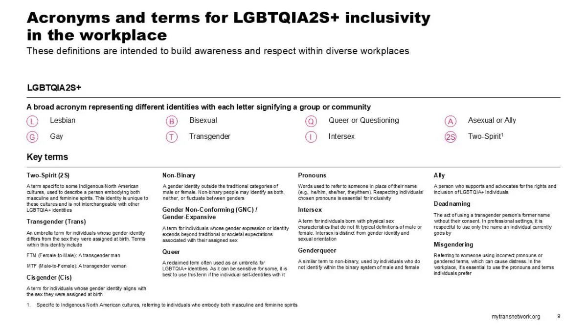
The LGBTQIA2S+ Inclusion presentation features a detailed slide deck, designed to educate and inspire change within workplaces. From defining key terms to showcasing the financial and emotional costs of exclusion, the slides present actionable solutions for fostering inclusive environments. It integrates a variety of content types: from facts and statistics to reflection prompts and best practices, giving a holistic view of LGBTQIA2S+ workplace inclusion.
Results and impact
40%
Improvement in engagement
After the presentation was shared with several organizations, feedback and engagement rose by 40%. Teams implemented action steps from the presentation, such as offering gender-neutral restrooms and instituting Employee Resource Groups (ERGs) for LGBTQIA2S+ employees.
Increased awareness of workplace inclusion
The presentation was met with overwhelmingly positive feedback, with participants expressing a better understanding of LGBTQIA2S+ inclusion and actionable steps to create safer and more inclusive workplaces.
Positive organizational feedback
Organizations reported that the resources provided within the presentation helped to drive internal policy changes, including the introduction of more inclusive hiring practices and better visibility for LGBTQIA2S+ employees.
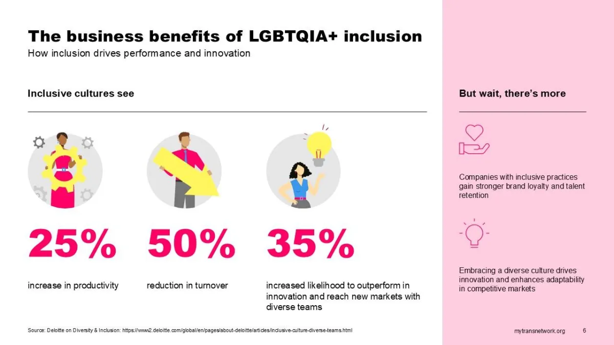
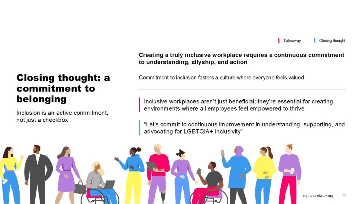
Highlighting the direct business benefits of LGBTQIA2S+ inclusion, such as enhanced productivity, innovation, and employee retention.
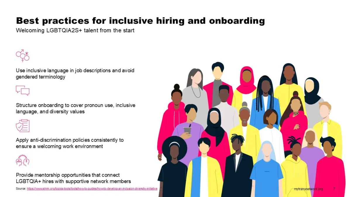
This slide provides best practices for inclusive hiring, emphasizing the importance of using gender-neutral language and applying anti-discrimination policies.
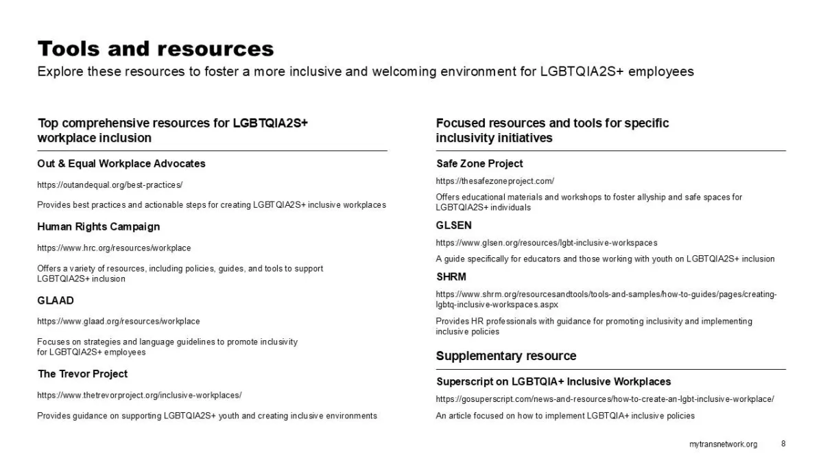
A helpful guide to key tools and resources, including organizations like Out & Equal and GLSEN, dedicated to promoting LGBTQIA2S+ inclusivity.
Pulsar Measurement’s Downloads Center, offering easy access to product brochures, technical specifications, and more
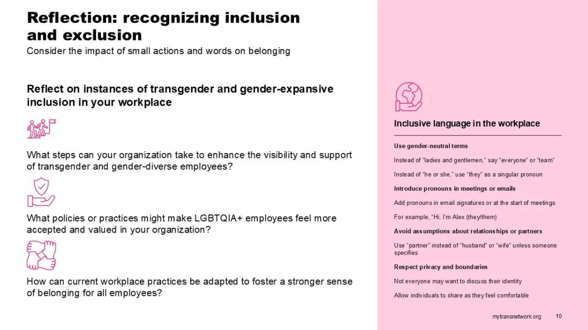
An introspective slide encouraging organizations to reflect on their practices and identify areas for improvement in LGBTQIA2S+ inclusion.
