Designing for accessibility: creating an inclusive digital experience
Project overview
This PowerPoint presentation focuses on creating inclusive digital experiences for all users, particularly emphasizing accessibility in design. The deck educates teams and organizations on how to implement accessible digital practices that support users with various needs. It includes key strategies like using alternative text, ensuring contrast ratios, and following best practices in universal design. Through well-structured slides and clear visual identity, the presentation provides actionable steps for making digital content and experiences more accessible.
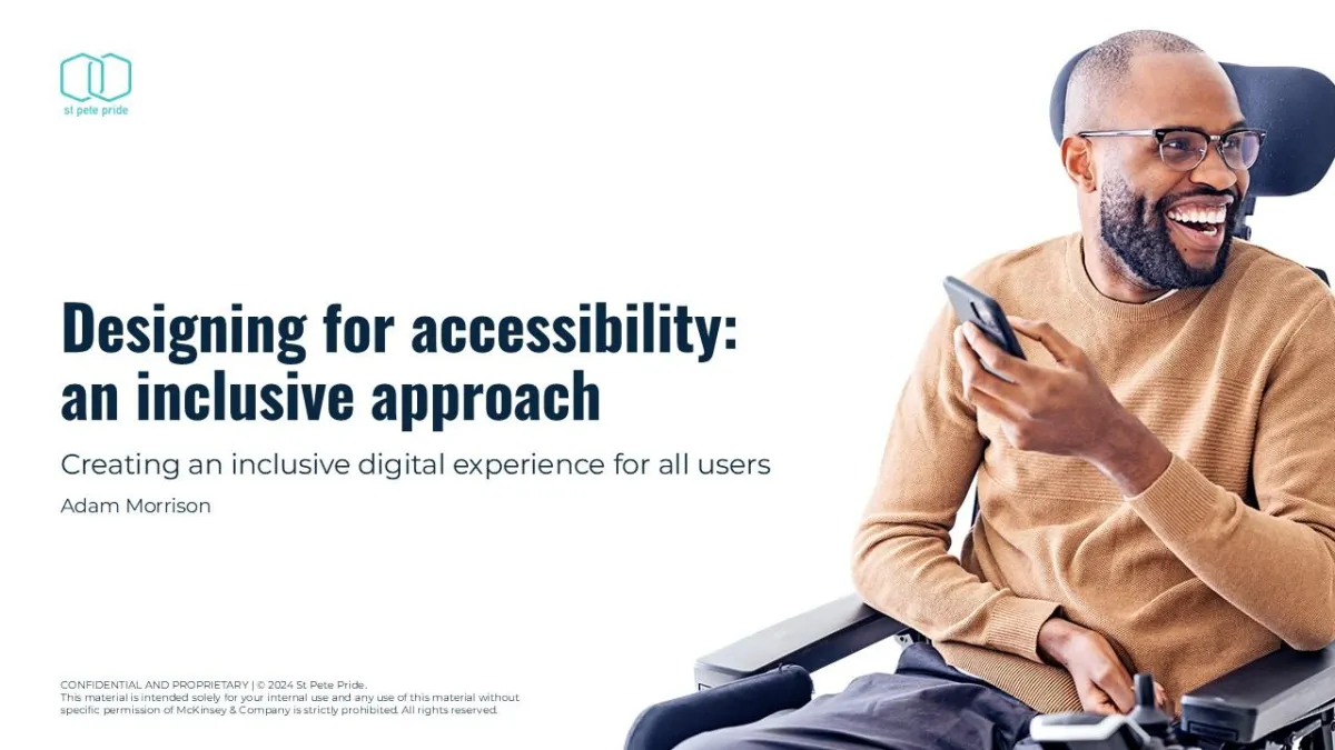
Designing for Accessibility: A thoughtful approach to creating an inclusive digital experience for all users, featuring a diverse individual engaging with technology in an accessible environment.
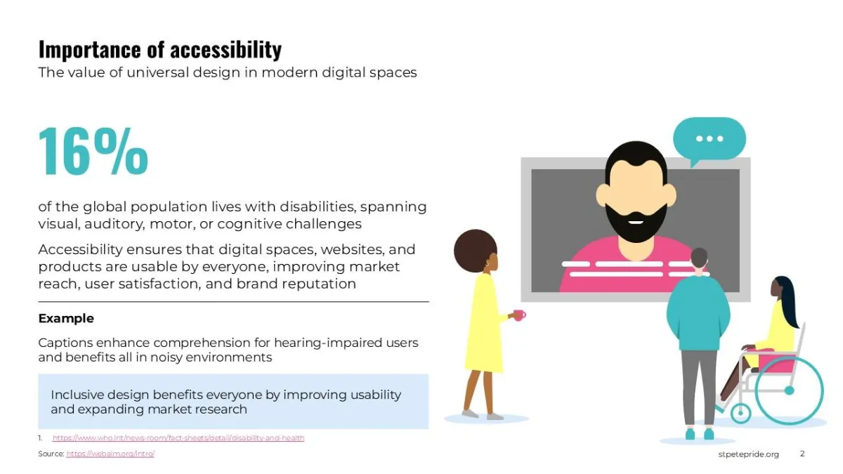
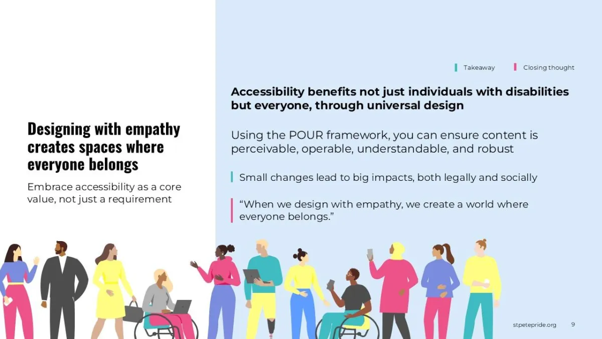
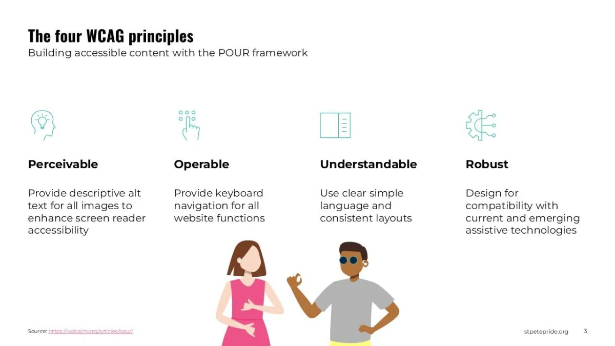
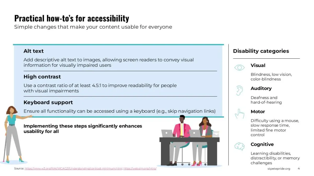
Illustrating key accessibility principles in digital design, ensuring inclusivity for all users by considering diverse needs and user experiences.
This slide outlines the real-world costs of exclusion, including increased turnover rates and the financial impact on businesses.
Key strategies for creating safe, welcoming workplaces, including policies like ERGs, gender-neutral restrooms, and inclusive signage.
This slide emphasizes the significance of using correct pronouns and inclusive language, providing actionable tips for improving communication in the workplace.
Process overview

Research
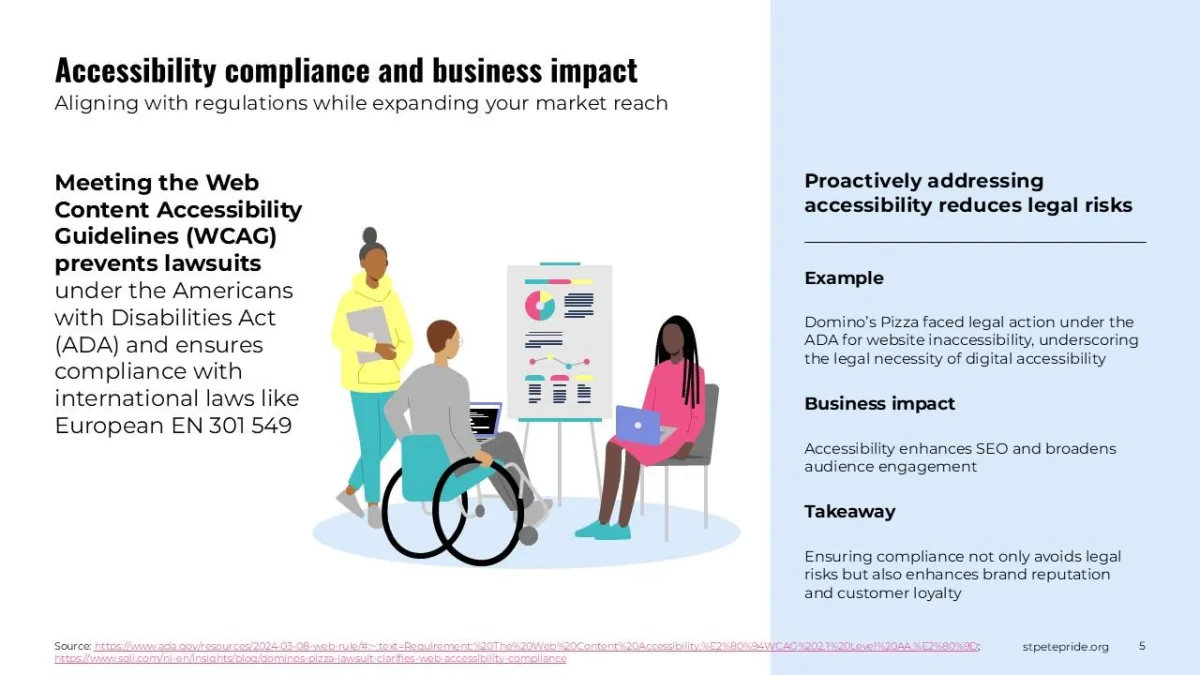
To develop this deck, I conducted in-depth research on the importance of accessibility in digital spaces, reviewing resources from organizations such as WCAG (Web Content Accessibility Guidelines) and ADA compliance materials. The research focused on real-world examples, accessibility laws, and the business impacts of inclusive design, making the case for digital accessibility as both a legal requirement and a best practice for enhancing user experience.

Design strategy
The design for this deck adhered to a clean and modern aesthetic, ensuring accessibility both visually and functionally. I used high contrast and clear typography, alongside intuitive icons and illustrations to represent accessibility principles. Each slide was crafted to be visually engaging yet simple, ensuring users of all abilities could understand the core concepts. The slides used a consistent layout and a color palette that adhered to accessibility guidelines, including sufficient contrast for users with visual impairments.

Execution
Using Adobe Creative Suite and PowerPoint, I designed a series of slides that communicate key accessibility concepts effectively. The presentation features simple, easy-to-read text, infographics, and icons to highlight accessibility topics such as text alternatives for images, keyboard navigation, and color contrast. Throughout the slides, I ensured that the content was accessible to people with different types of visual, auditory, and cognitive impairments, following established accessibility best practices for digital design.
The final product
The final product is a visually appealing and educational presentation that introduces core accessibility concepts while also illustrating how these can be implemented in practical terms. It provides a roadmap for web developers, designers, and digital marketers to follow in order to improve accessibility on their platforms. This project served as both an educational tool and a call to action for businesses and organizations to adopt inclusive design principles in their digital experiences.
Results and impact
30%
increase in engagement
After sharing this presentation with several teams, we saw a 30% increase in engagement from stakeholders, with many participants seeking additional resources on web accessibility and beginning to implement more inclusive design practices.
Positive feedback
Following the launch of the presentation, feedback from internal teams and stakeholders indicated increased awareness of digital accessibility standards and practices. The presentation helped facilitate discussions on improving web accessibility within the company, leading to a more inclusive approach to digital design across the organization.
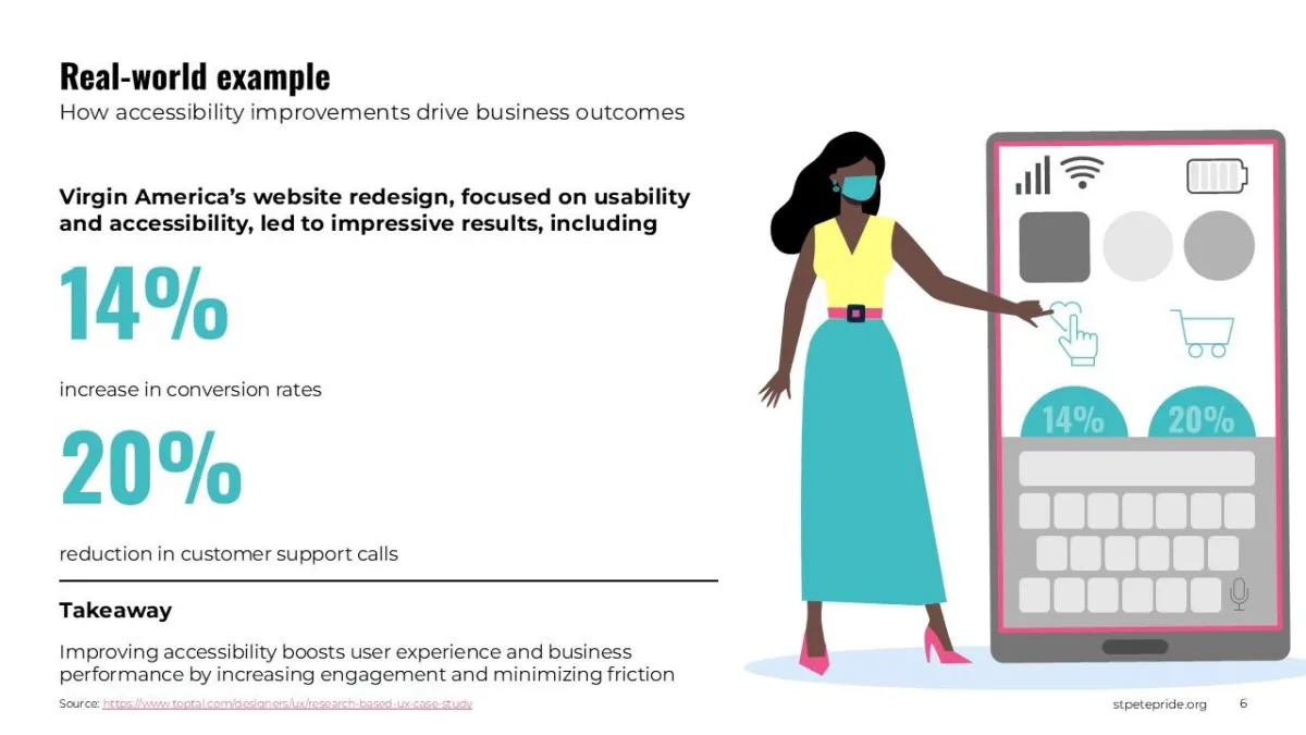
Highlighting the direct business benefits of accessibility improvements, such as enhanced productivity, innovation, and employee retention.
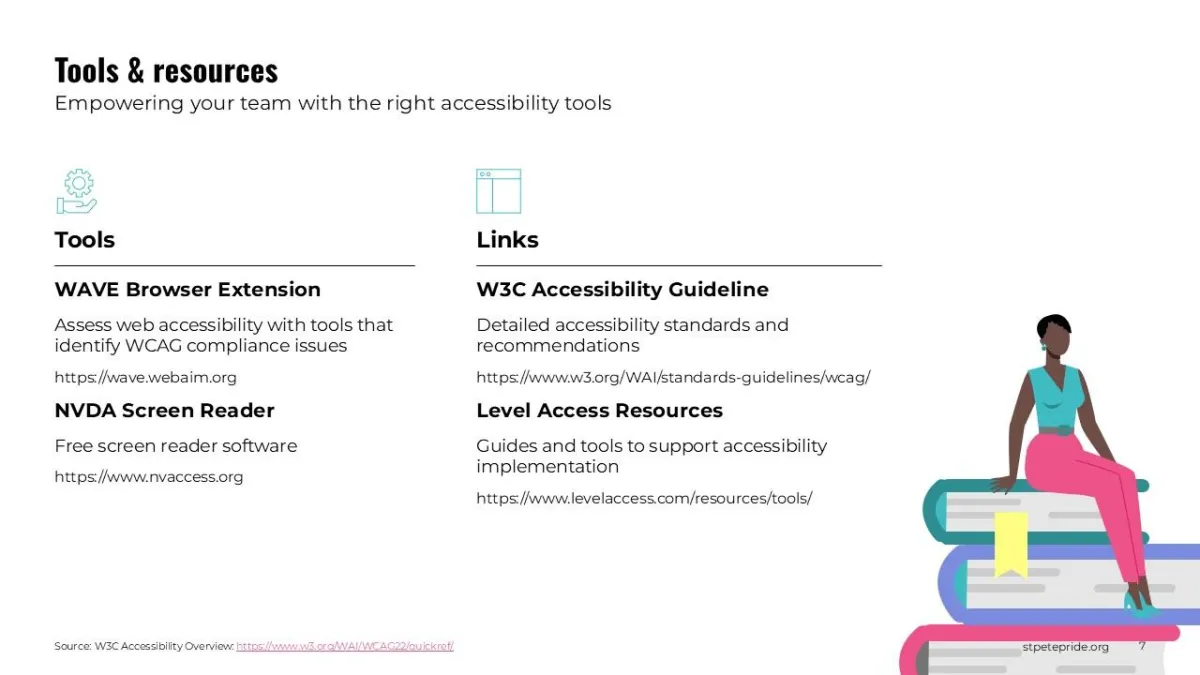
This slide provides best practices for inclusive hiring, emphasizing the importance of using gender-neutral language and applying anti-discrimination policies.
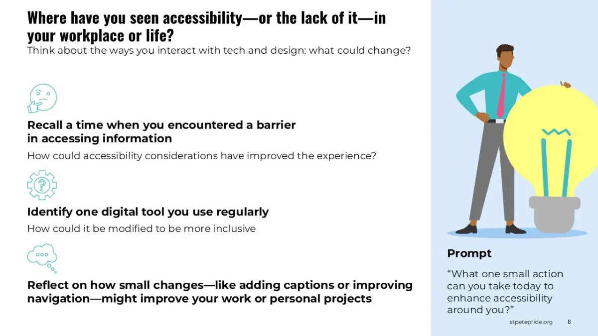
A helpful guide to key tools and resources, including organizations like Out & Equal and GLSEN, dedicated to promoting LGBTQIA2S+ inclusivity.
